Website Curb Appeal
 This seems like it should be common sense, but I see a lot of companies that don’t capitalize on their “curb appeal.” What I mean is the landing page, the front page of your website. The thing that customers see first thing when they get to your page. This is possibly your ONLY chance to hook them on your product or service.
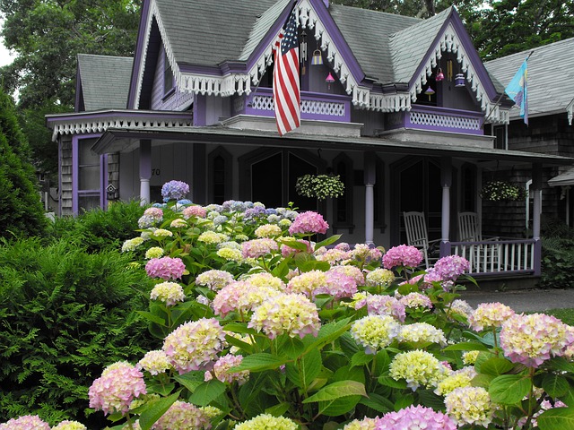
The landing page should be clean, beautiful, and showcase YOUR PRODUCT. If you are a service company, it should showcase an image that really represents your brand. Whether that is YOU, or happy customers, the image should really knock people’s socks off. This may mean hiring a photographer or spending money on a pro image. You can and should change this occasionally, and maybe you will find that some photos work better.
Don’t waste your landing page curb appeal by having an image that isn’t your product, or one that doesn’t really represent your brand. Another issue is too much text above the fold, or poor layout. You want your landing page to be EASY for people to 1) know they are in the right place, 2) want to click through to your product/service, 3) be able to FIND WHAT THEY ARE LOOKING FOR with the least amount of clicking.
Have some people test your website. It should be only 2 clicks to get anywhere on the site, to add a product to a cart, or make an appointment. Your contact info should be easy to find, no matter what page they are on…and each page should be branded, be laid out beautifully, and be UPDATED. No out of date copyrights, no products that are out of stock, no employees that don’t work there anymore. Update your “news” or “blog” section. If the last entry is 3 years old, that gives a poor impression of your attention to detail.
This Spring, take a look at your website curb appeal. It might be time for some updating.