Banners: You Need to SEE IT
Since I work in the western/horse industry, I go to a lot of events. Horse shows, trade shows, rodeos. A big part of our industry is event marketing and sponsorship, which typically includes banners on an arena fence.
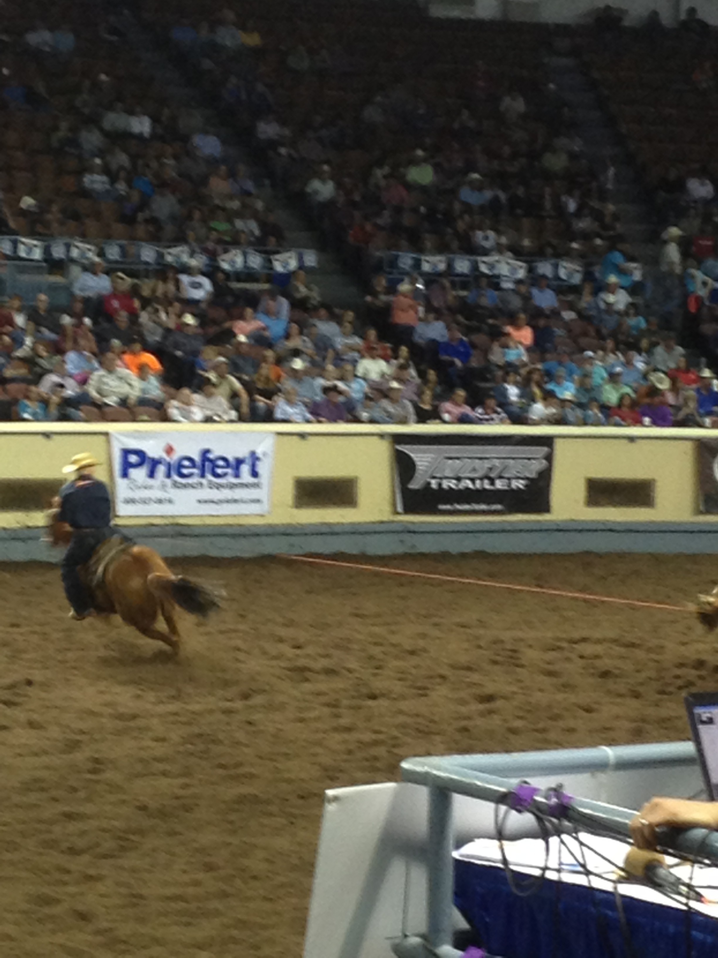
One of my biggest business pet peeves is cramming too much info into an advertising space. And one of the biggest WASTED marketing amenities for businesses is the banners themselves. If you can’t read or recognize what is on the banner from the bleachers/seats, then it is WASTED.
Think about your logo. If it has too much going on, people can’t recognize or see it from far away. A banner should NOT have your phone AND email AND website, AND a paragraph of information. NO one will be able to see it. It should have ONE way to contact you, your preferred method (usually website) of communication or more information, and your logo. THAT IS IT. And you don’t need www. anymore either. Less is more.
People are going to be sitting 50 feet or more away from the banner, they need to be able to READ and UNDERSTAND it. No crazy fonts, no extraneous information, no cramming as much on there as you can. Blowing up your business card is just not going to work.
If this is your second or third year at an event, look at who the other sponsors are and set yourself apart. If most banners are a white background, do a colored one (black or your standard business color that you always use with a white/black logo, don’t add random colors). If the banners are hanging outdoors, think about the sun coming through the back and the shadows of the fence on your logo/wording. Get a thicker banner or lay it out differently.
Don’t waste your “billboard” space and sponsorship amenity by wasting your fence/banner space. Visibility is everything, and a little thinking ahead will pay off by making your banner and business stand out from the rest.